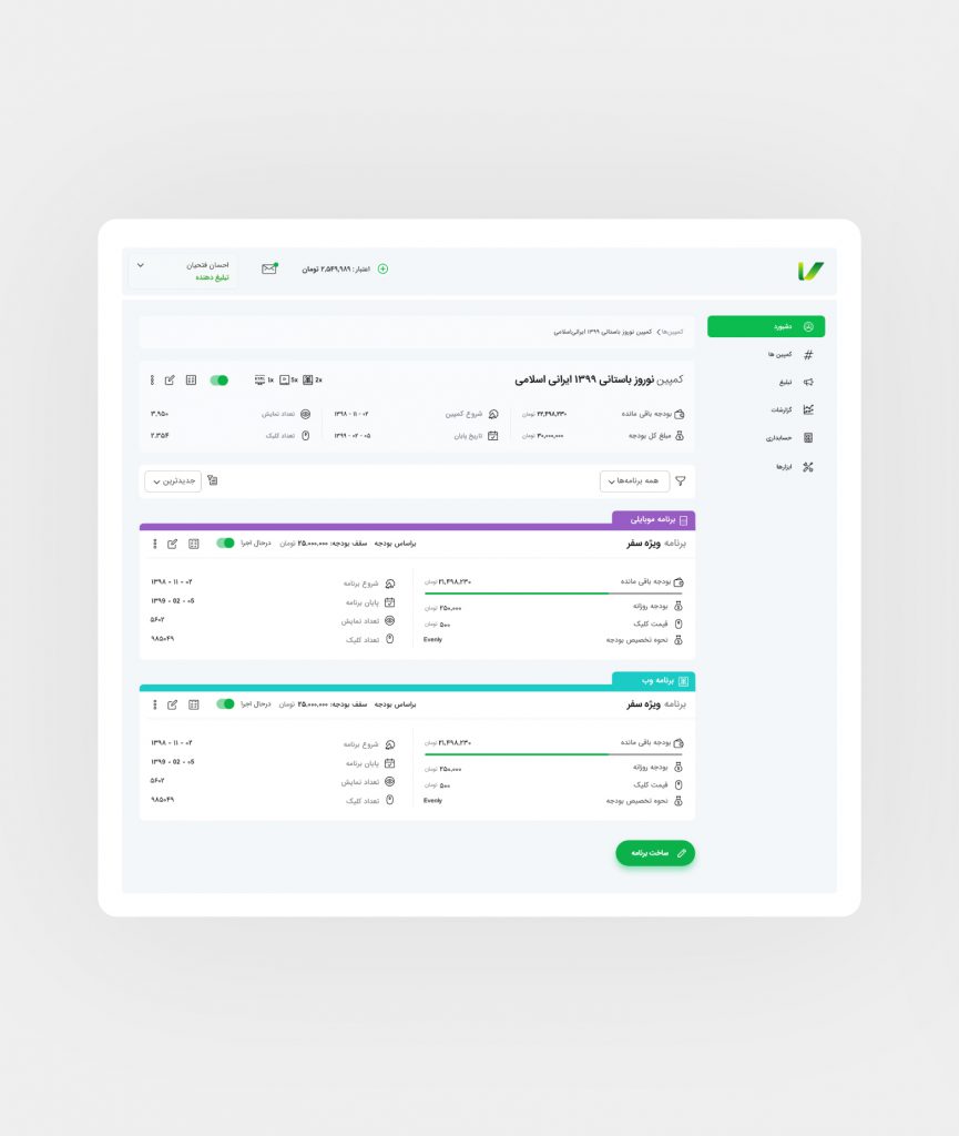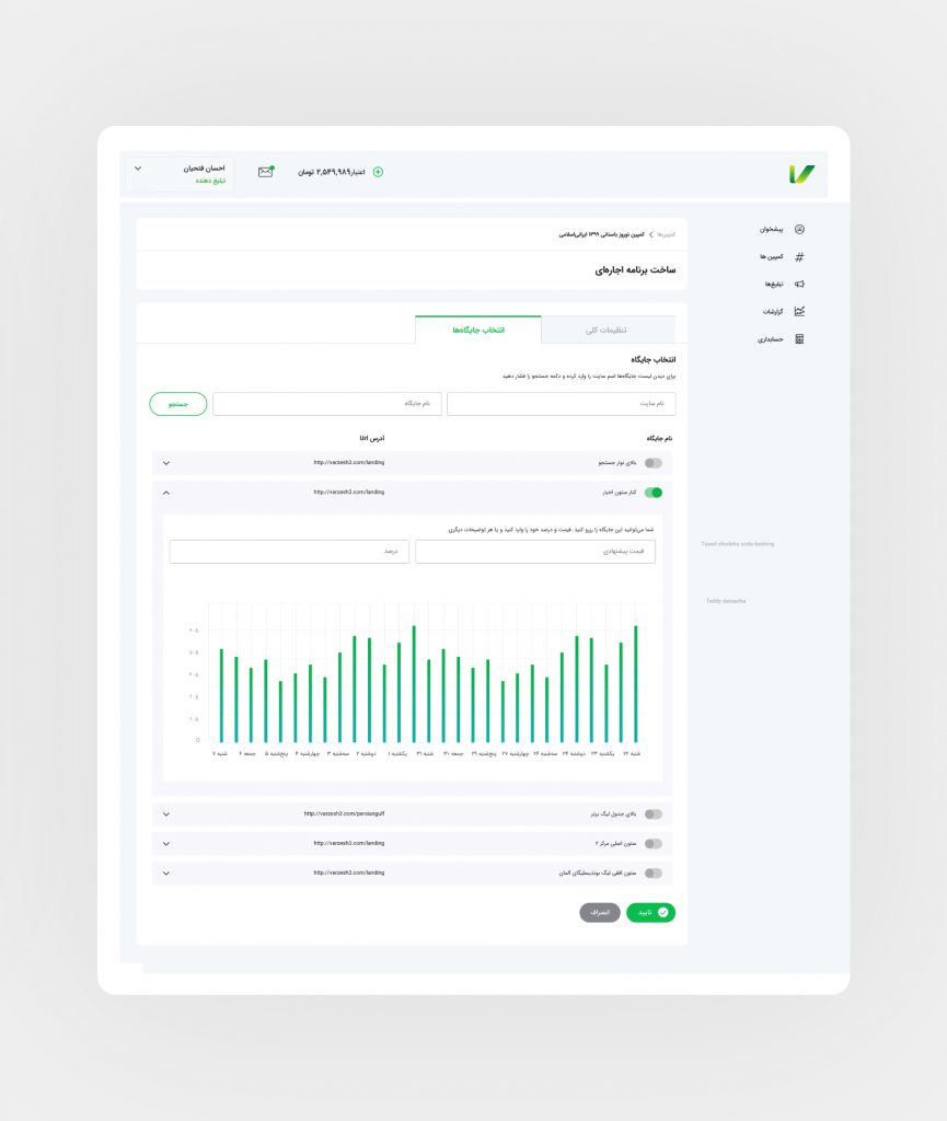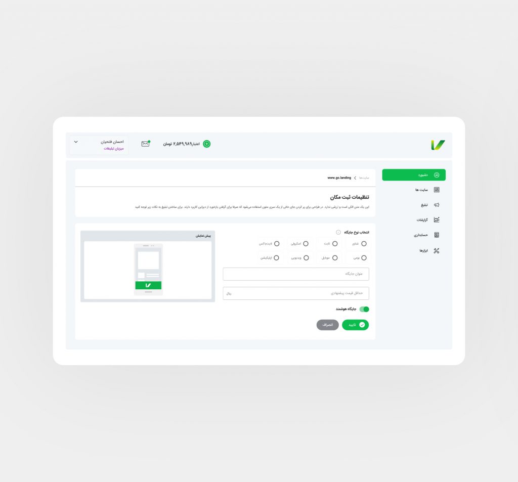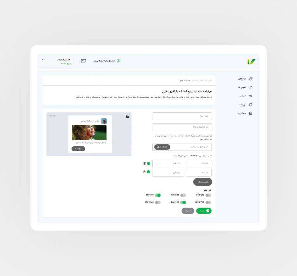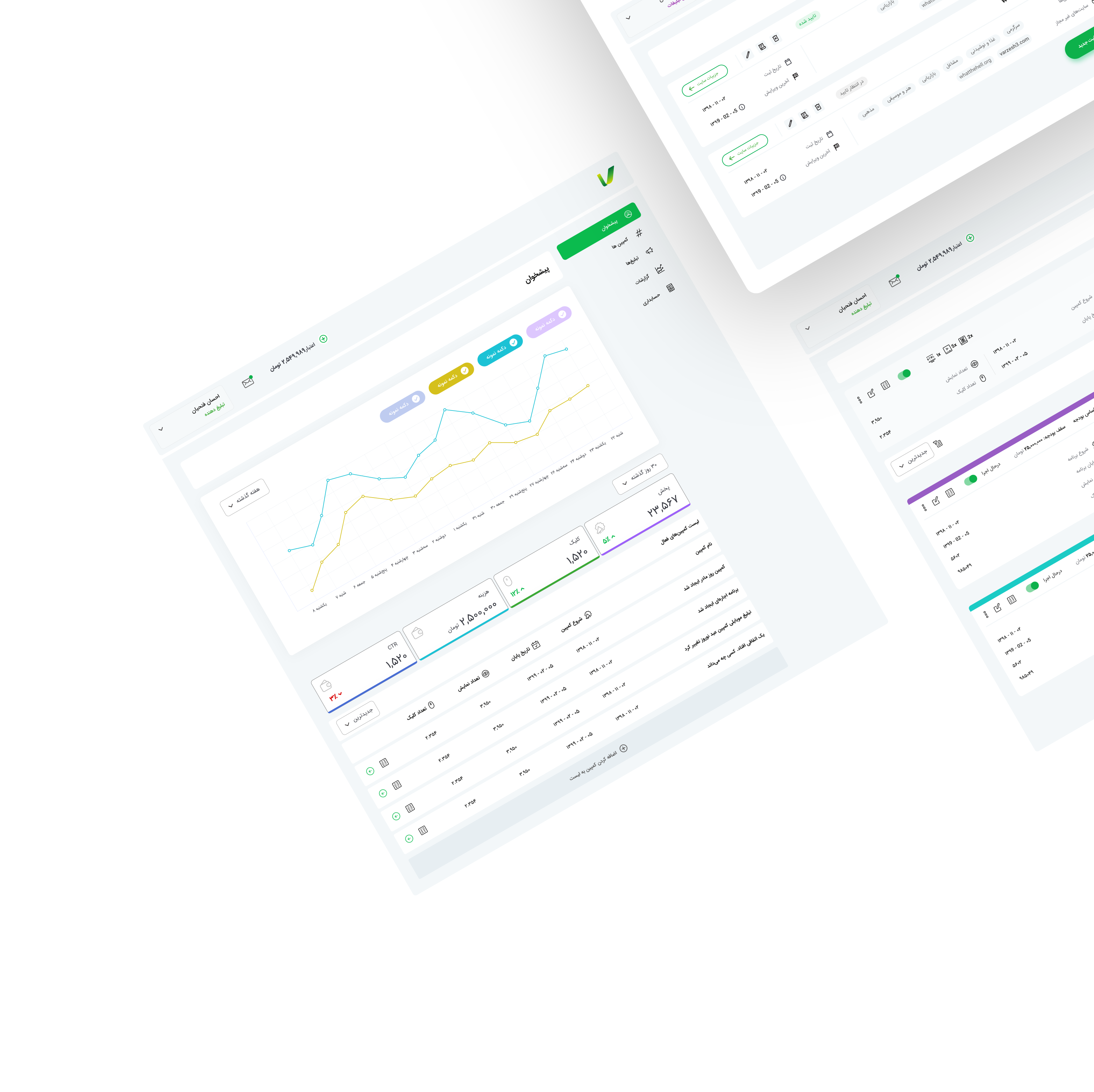
Vplus has been working for 10 years. Redesigning the whole UX and UI considering the current user needs was quite a challenge.
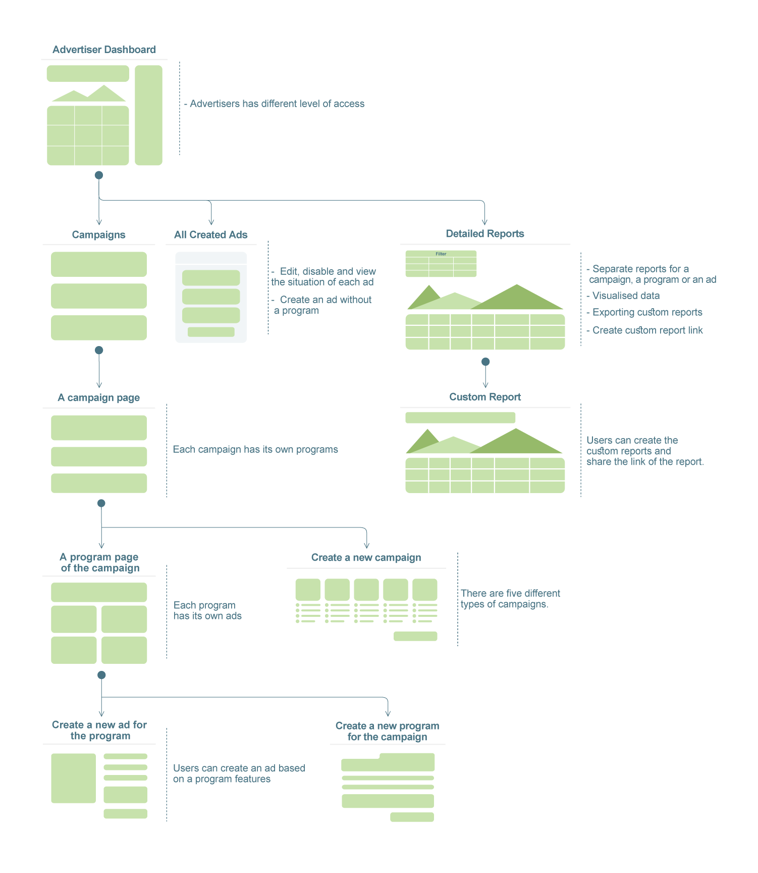
So the product had an extremely complicated IA (Information Architecture) that has never been organized in depth.
In the first step, we rebuilt the architecture based on benchmarking the competitors and interviewing the stakeholders.
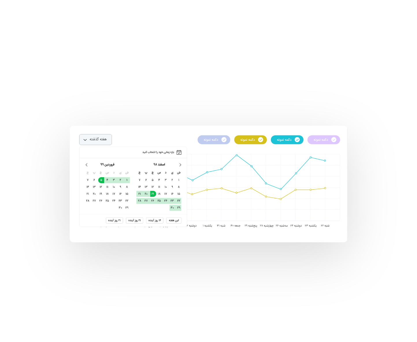
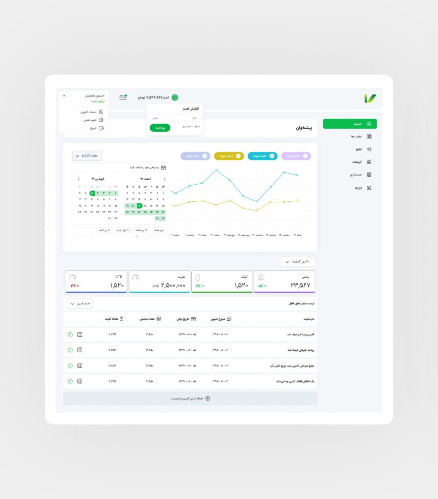
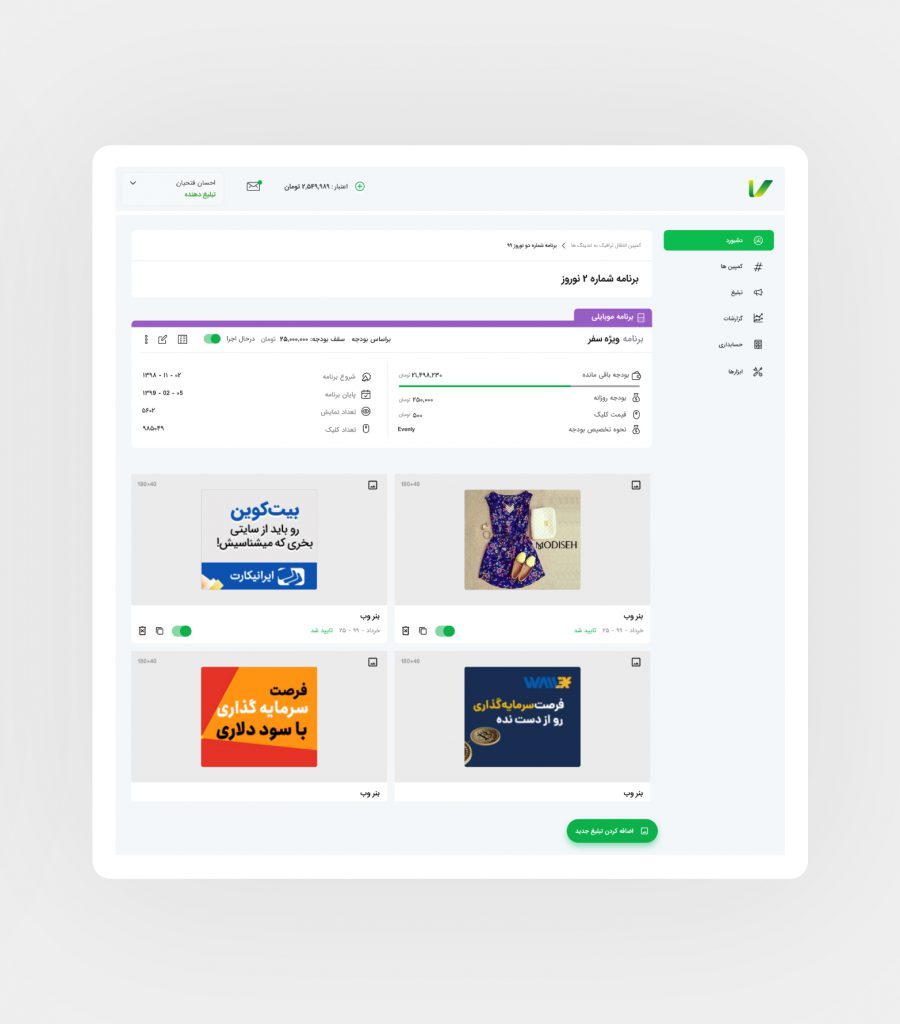
During this user research we also figured out that the dashboard environments were confusing for both sides, because of the unnecessary similar UI and user journey. We implemented unique elements to make user navigation clear and hassle-free.
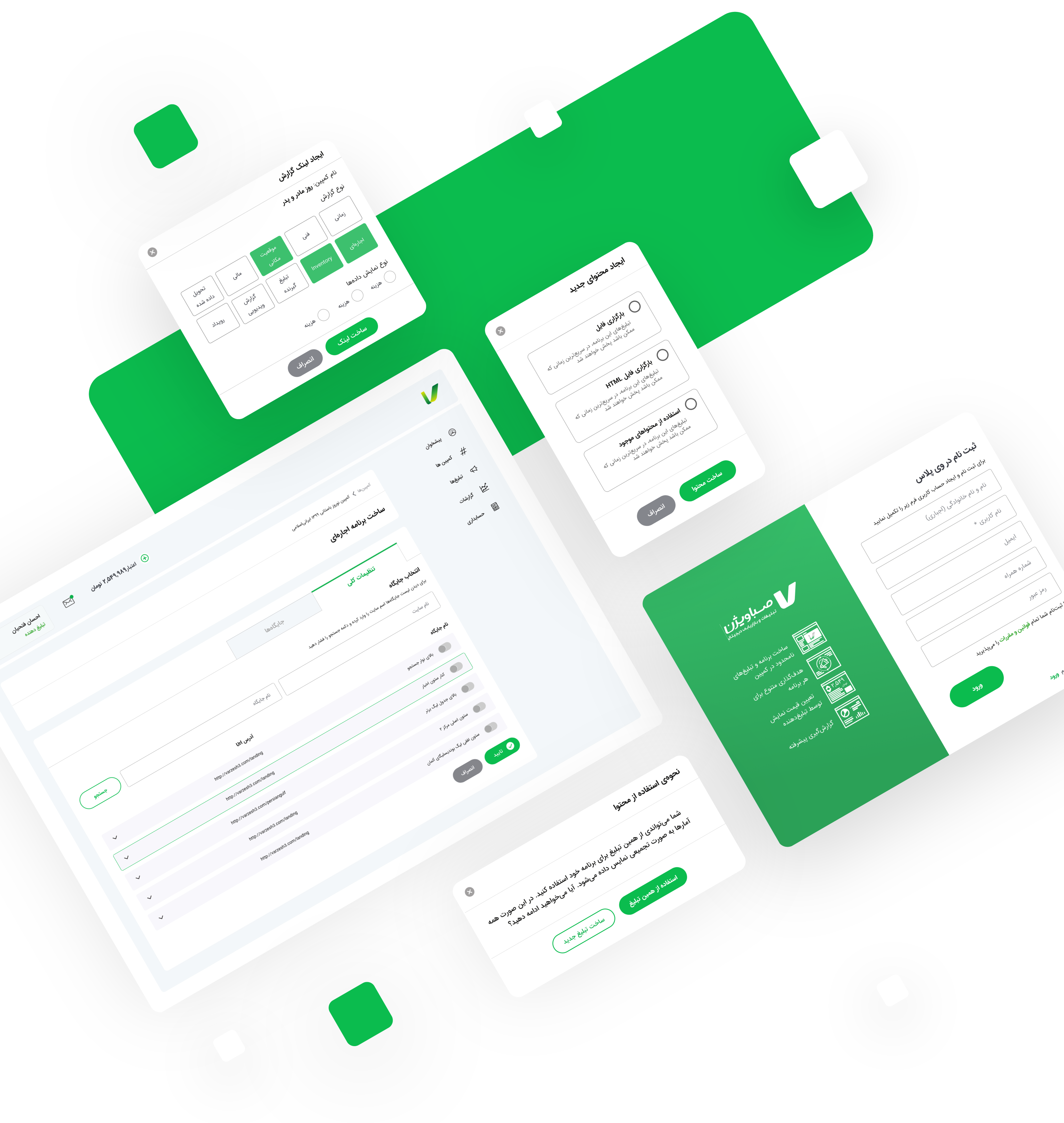
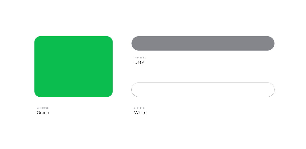
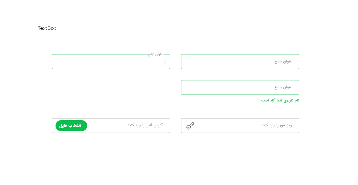
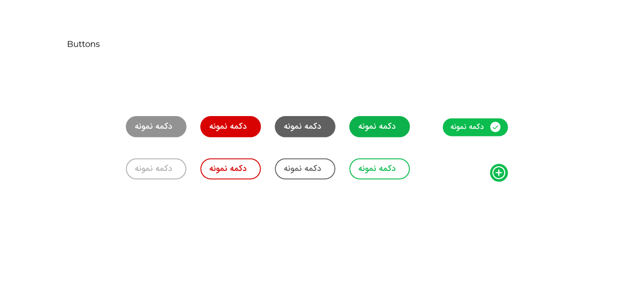
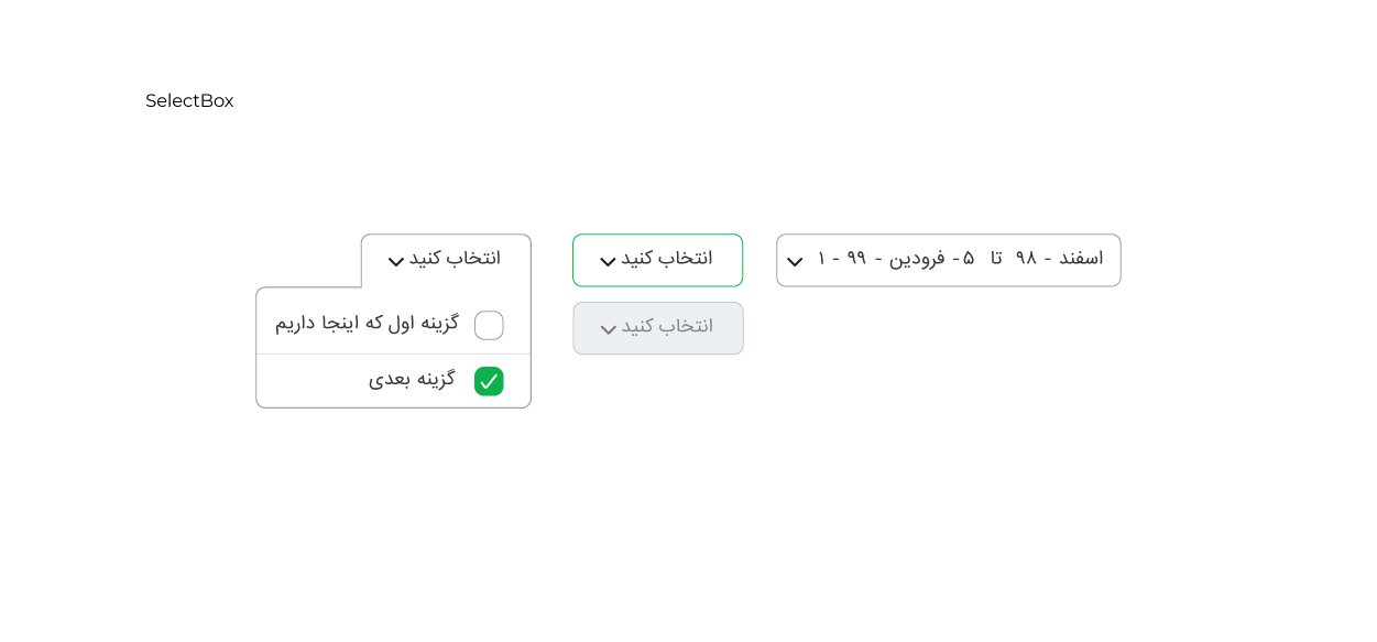
For the new interface, we wanted to stay loyal to the familiar sense for the users by combining the current brand identity whilst bringing freshness with an updated design language.
