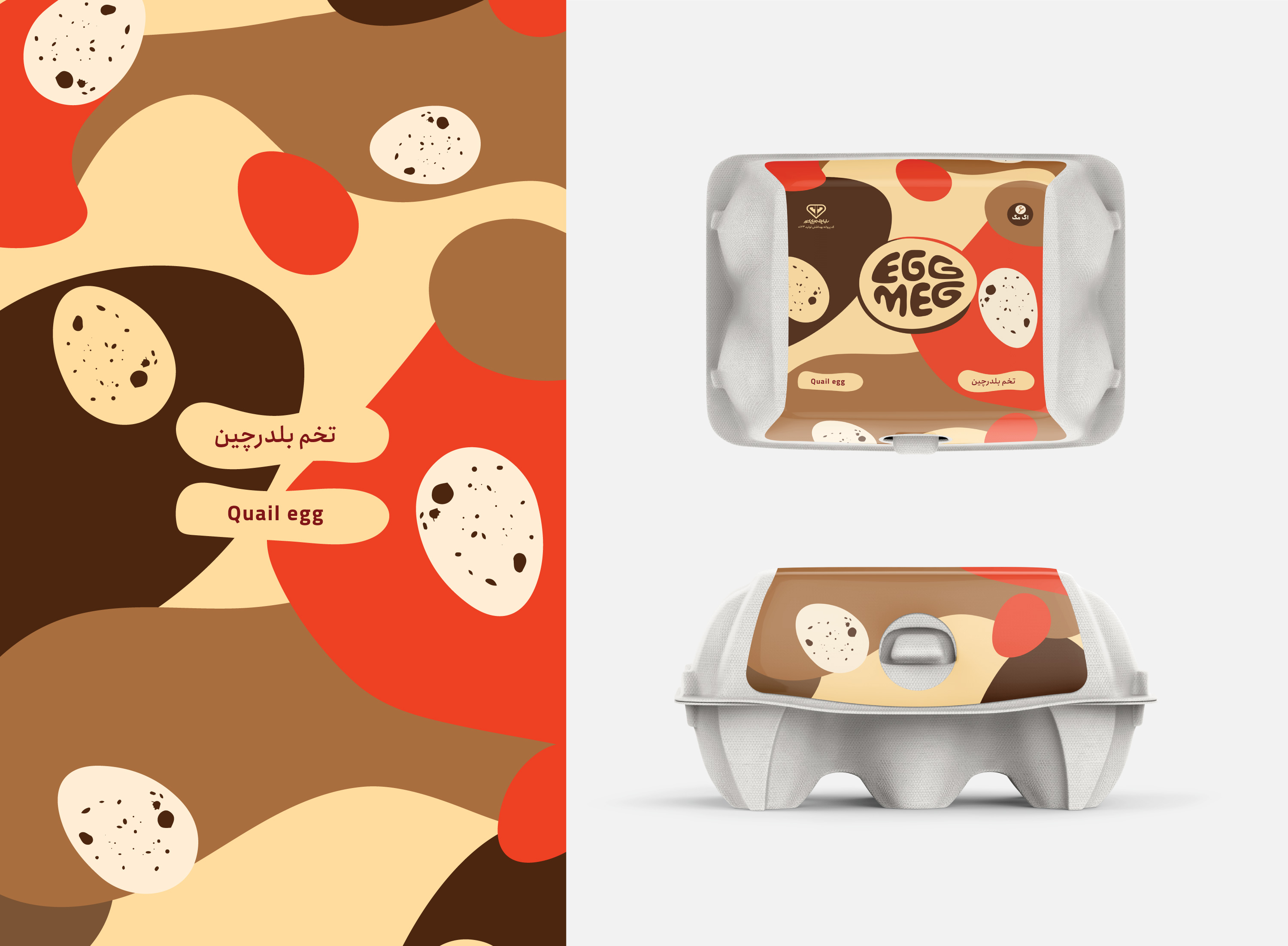
“EggMeg” is an everyday brand for one of the most essential consumer goods. EggMeg provides different kinds of bird eggs with superior quality. We were given the task to design an iconic and distinctive visual identity to specifically use in packaging as most significant touchpoint of a shelf product.
The name itself is the result of a naming process we undertook to find an easy-to-read, memorable and casual combination in both English and Persian.
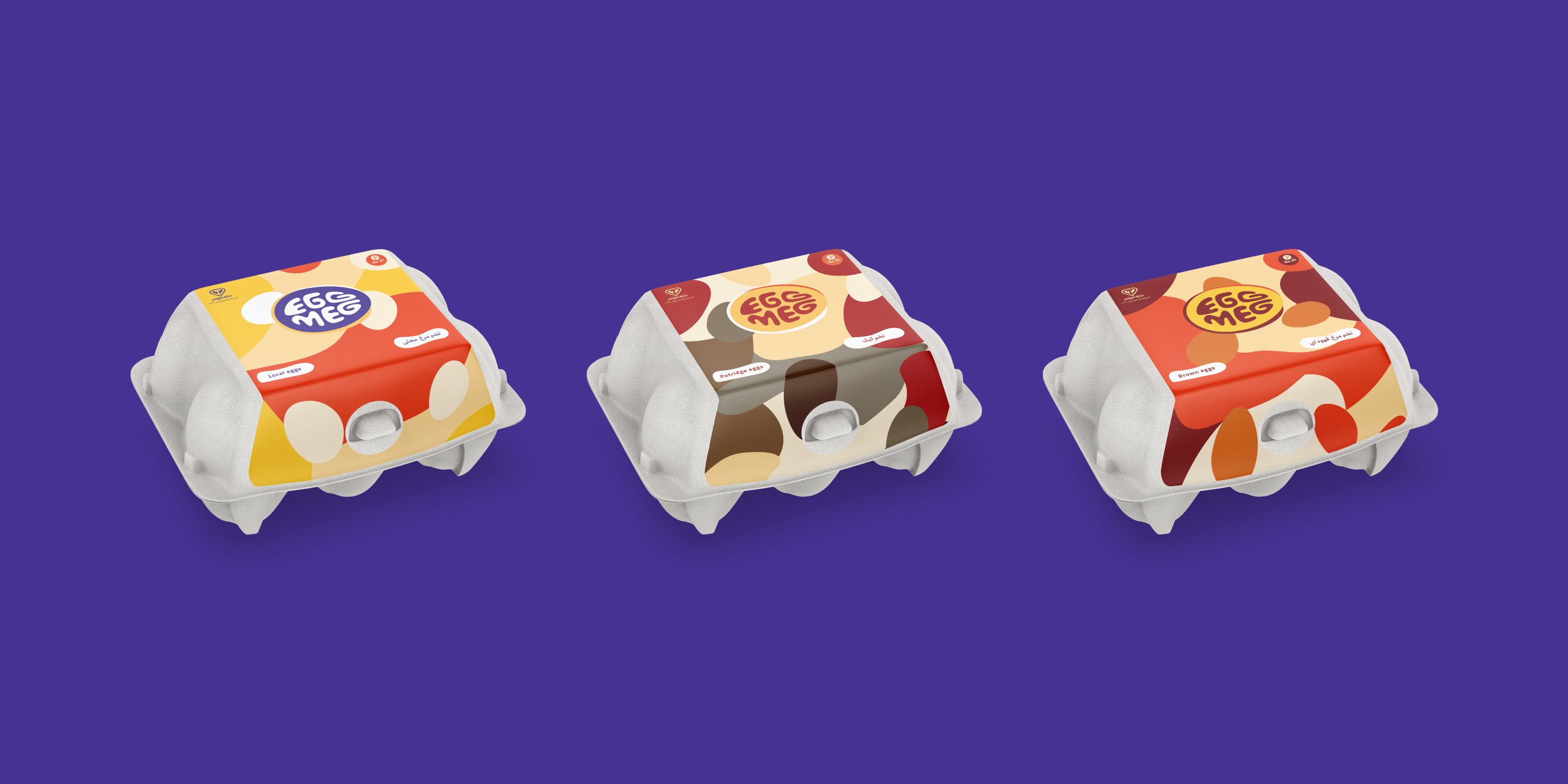


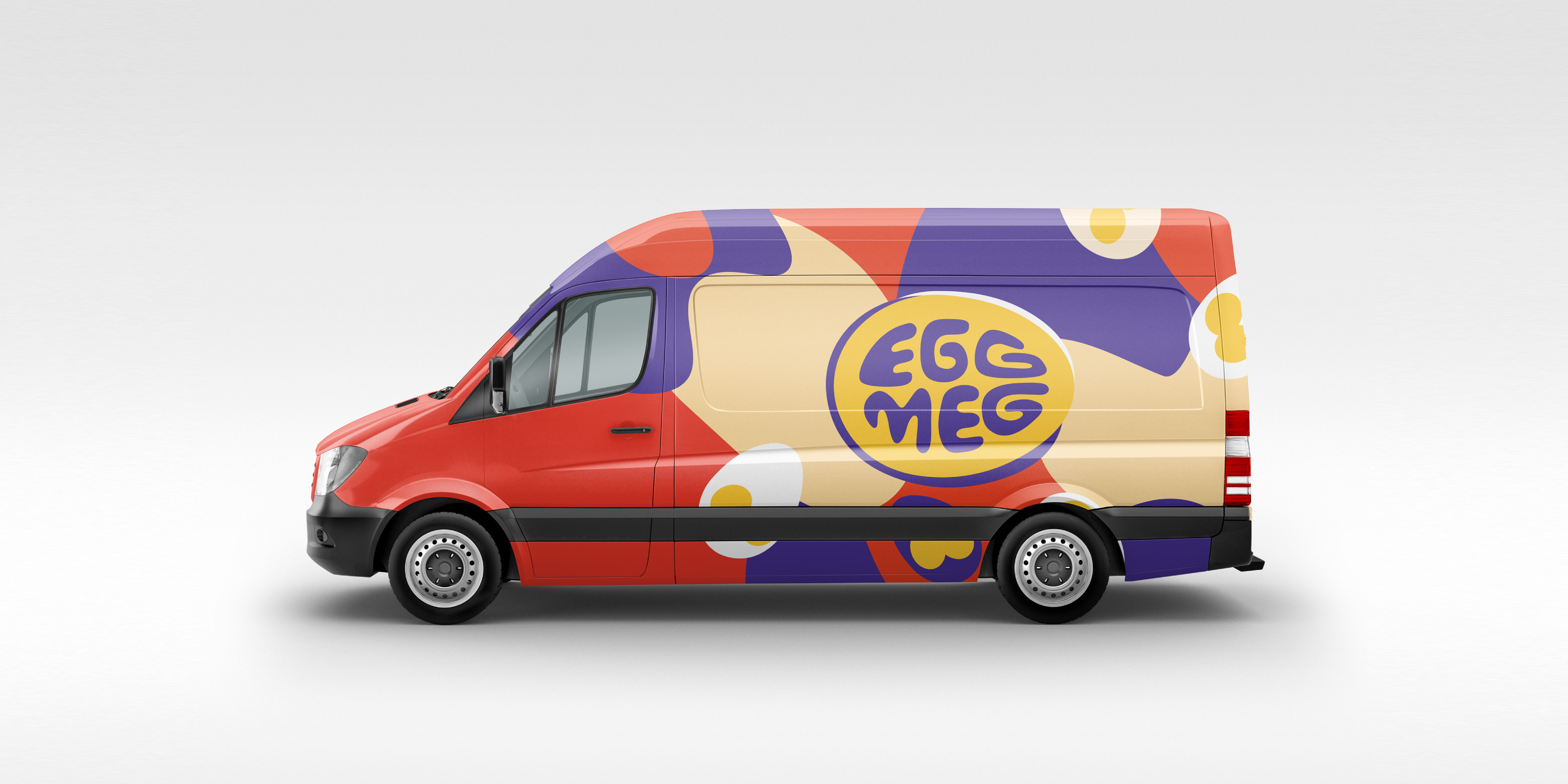
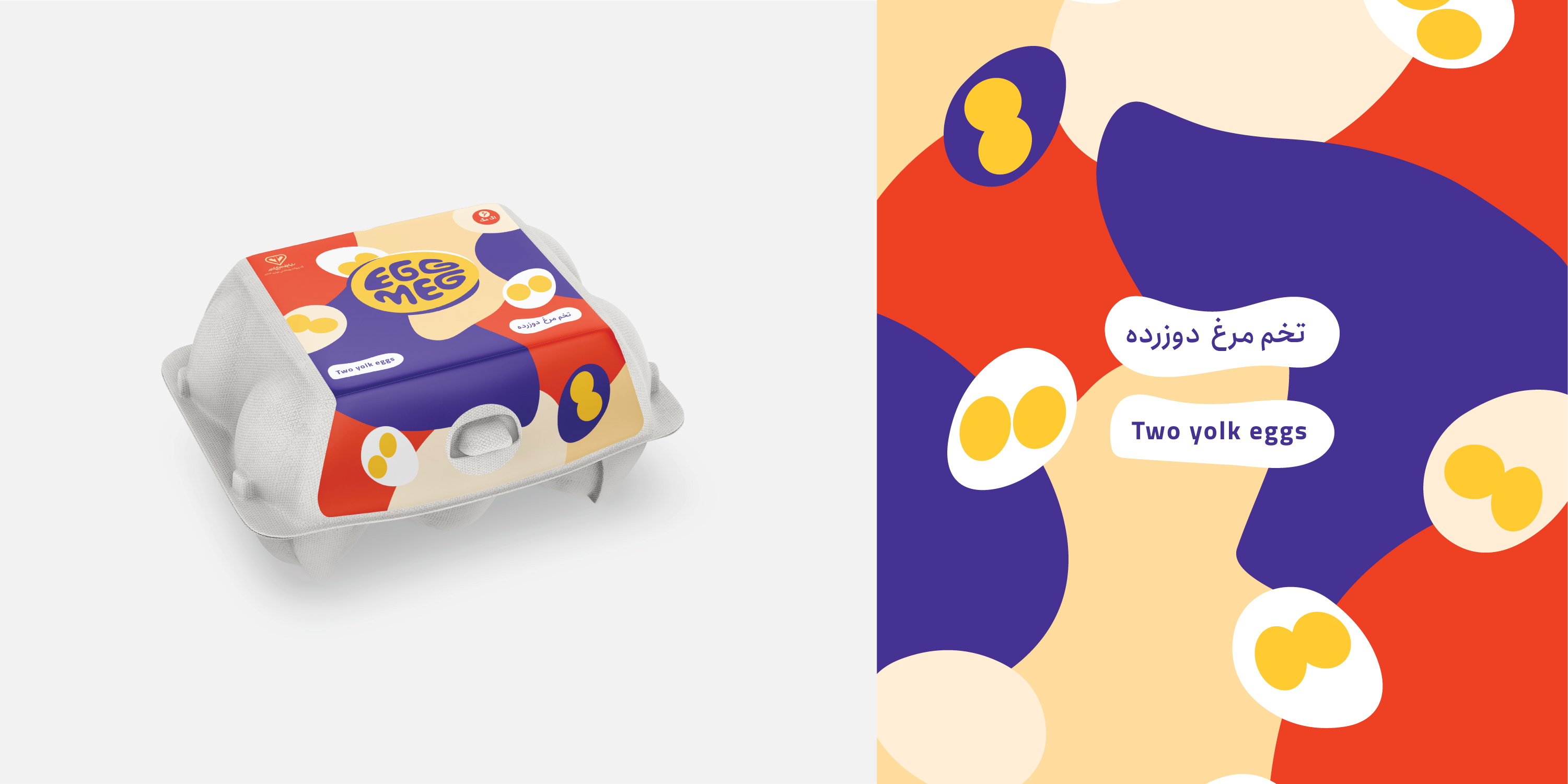
Vivid colors and funky patterns were designed to make an eye-catching look at first glance in a busy shelf.
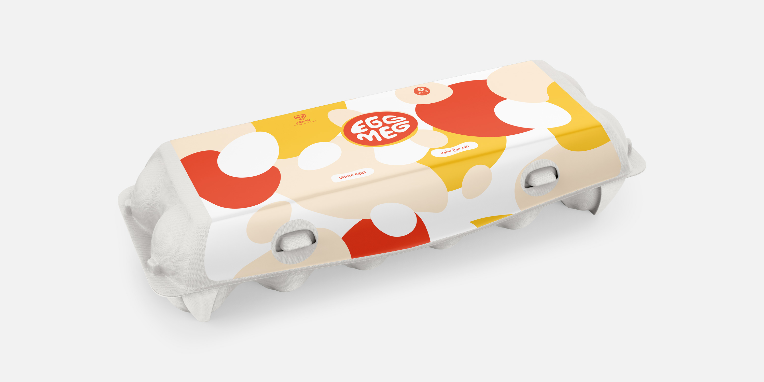

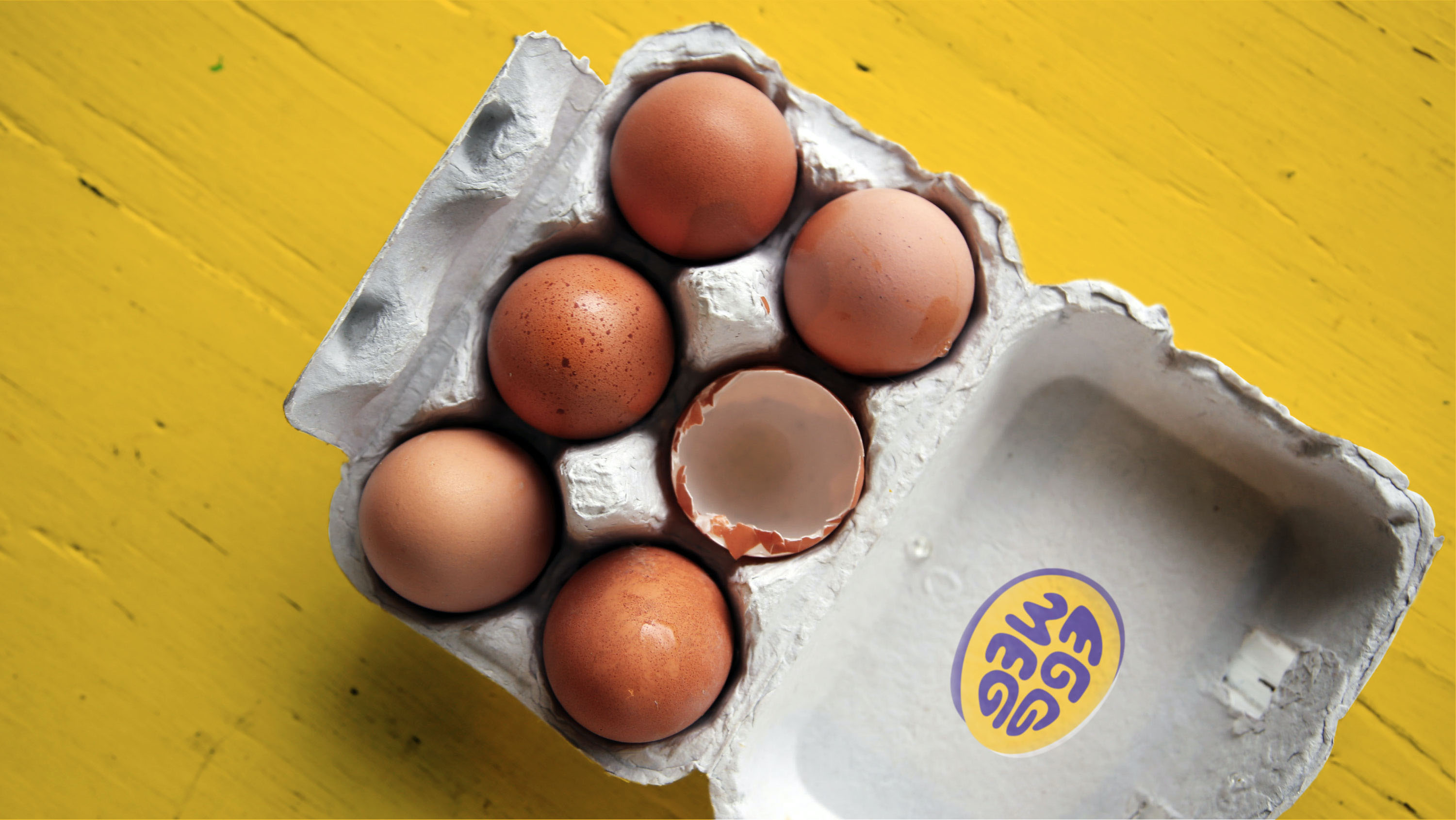
As well as creating a matching, yet distinguishable packaging line, patterns also allowed us to extend visual identity even further to future possible touch-points.